Role Art Director, Designer & Illustrator
Client Iho at Iha: Mga Barong Pambata
Year 2022
The Challenge
To create the complete branding and identity of Iho at Iha, facilitate the creative direction of its various collaterals, and execute stunning visuals for the brand through design and illustration
The client wanted a vibrant friendly look that would target children and their parents as the primary consumers with its friendly yet trendy atmosphere.
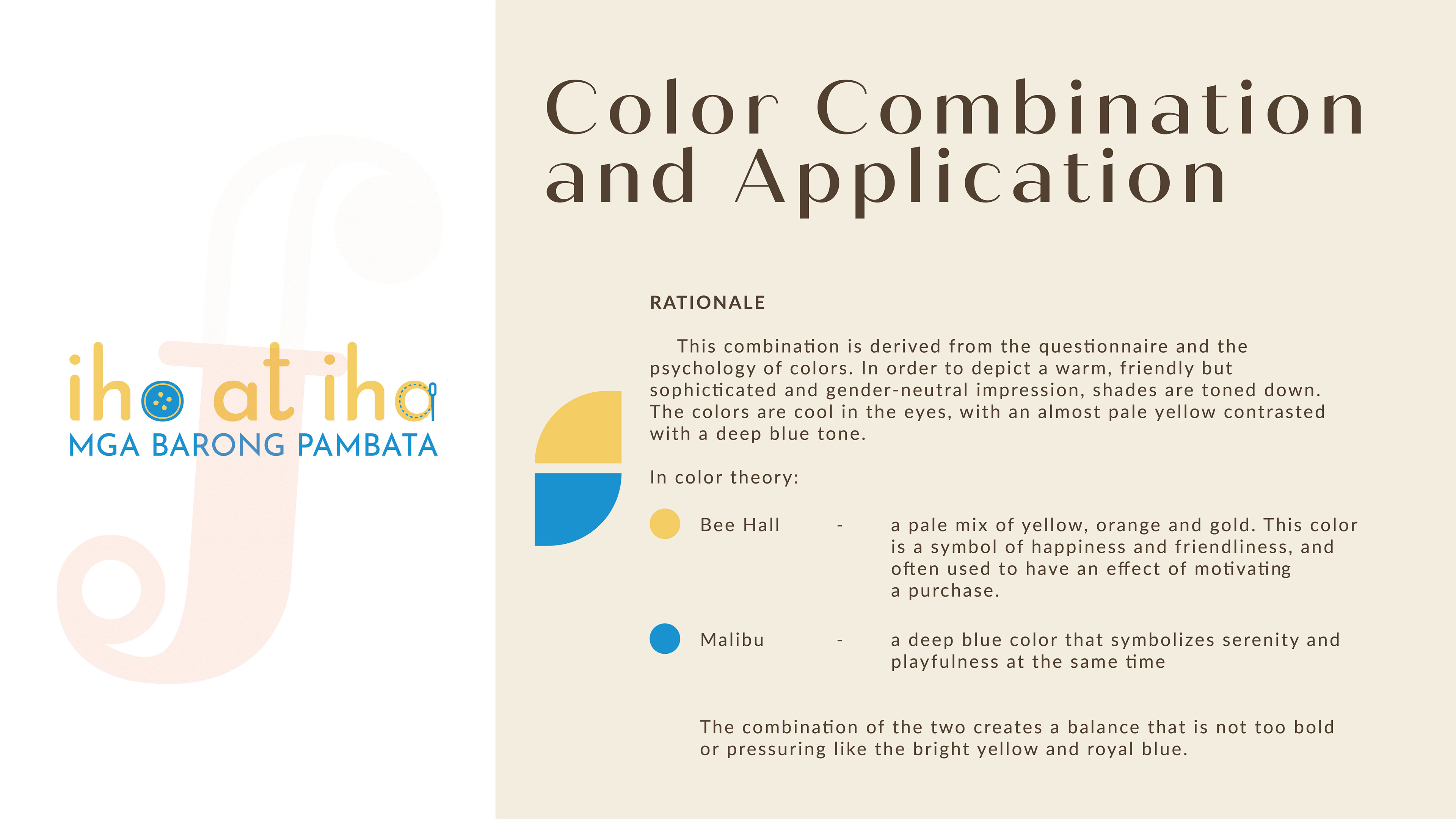
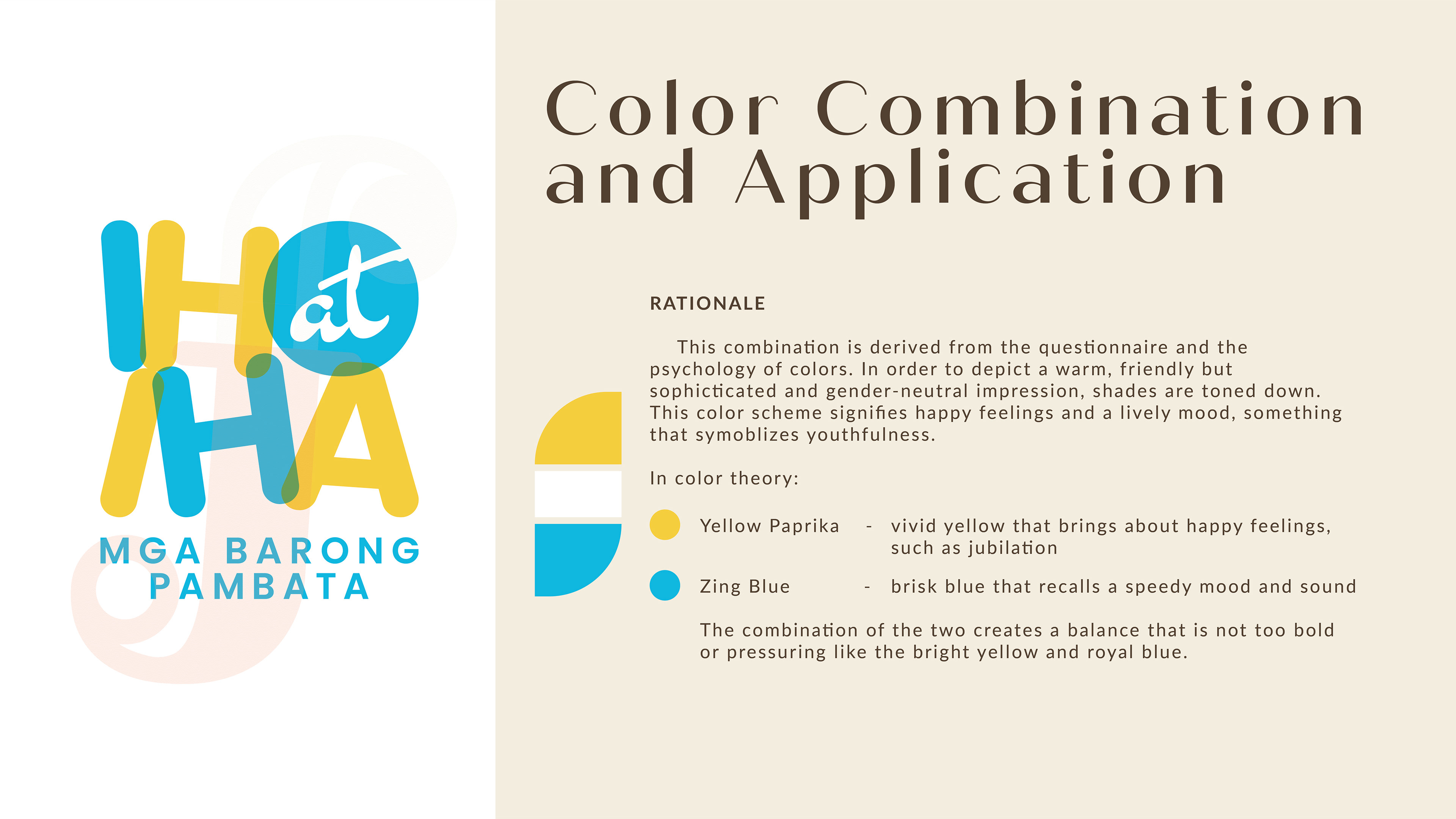
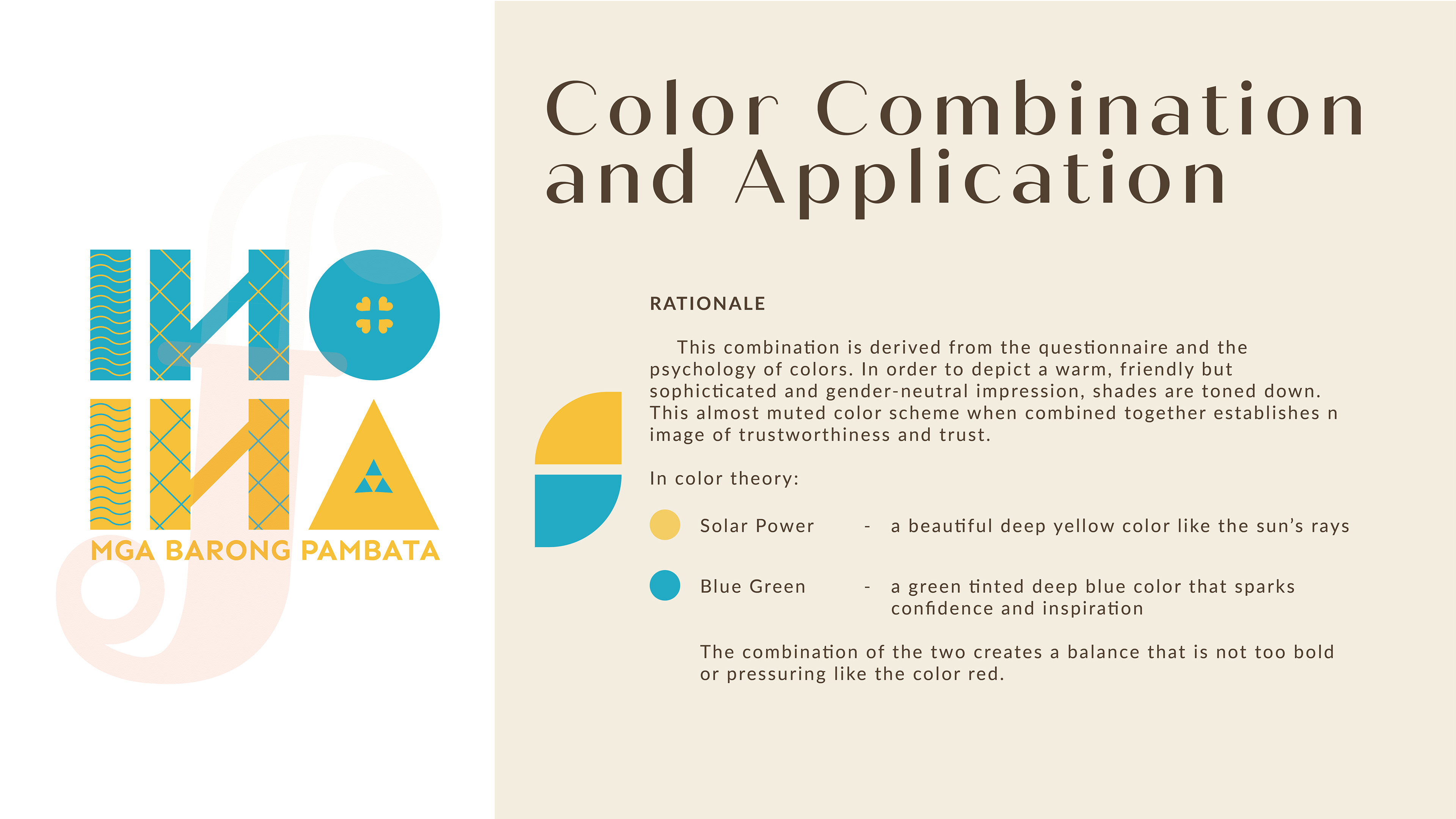
The colors used were vital to the brand conceptualization and creation, emphasizing the youthful, cute, and fun vibe.
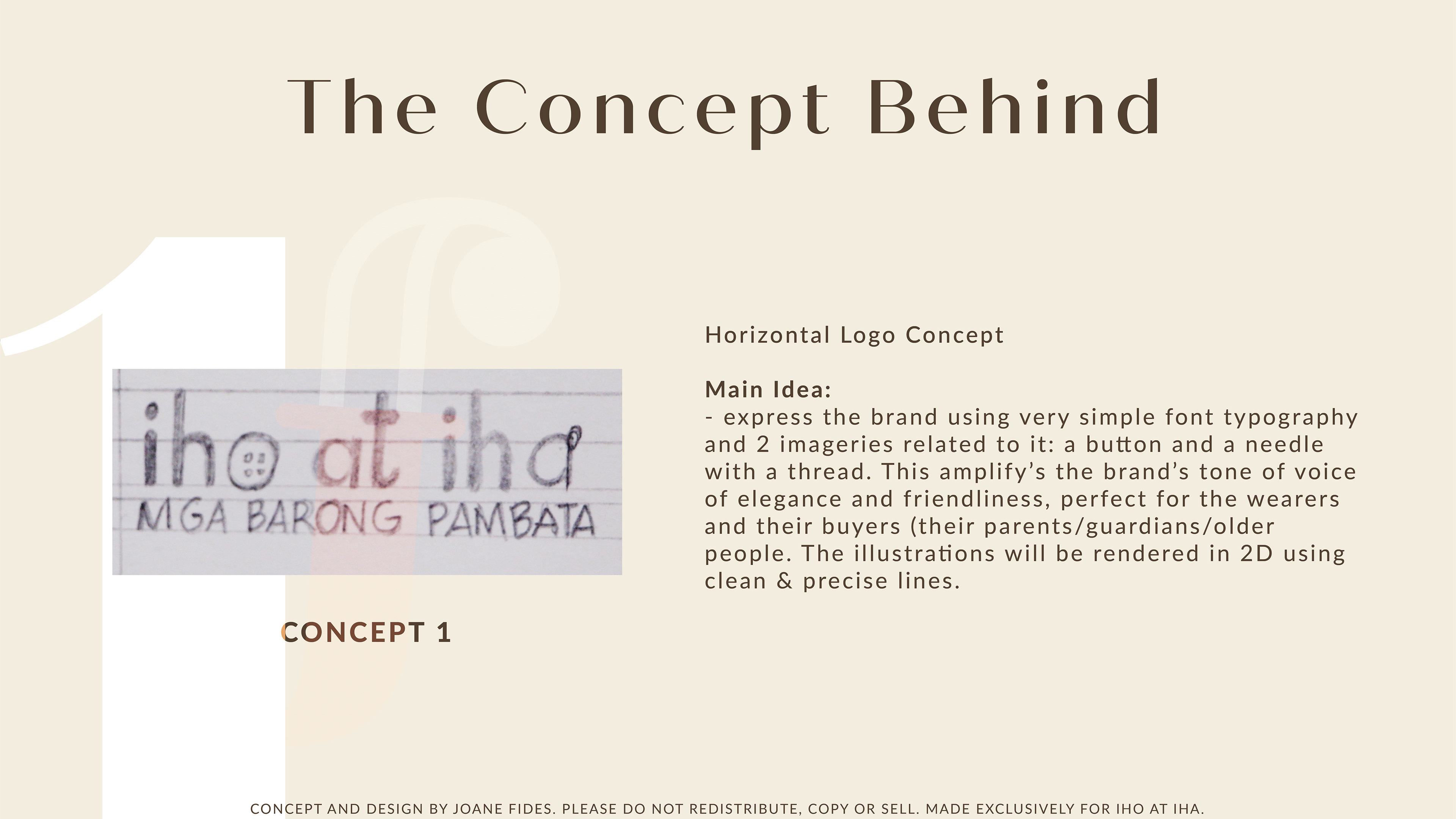
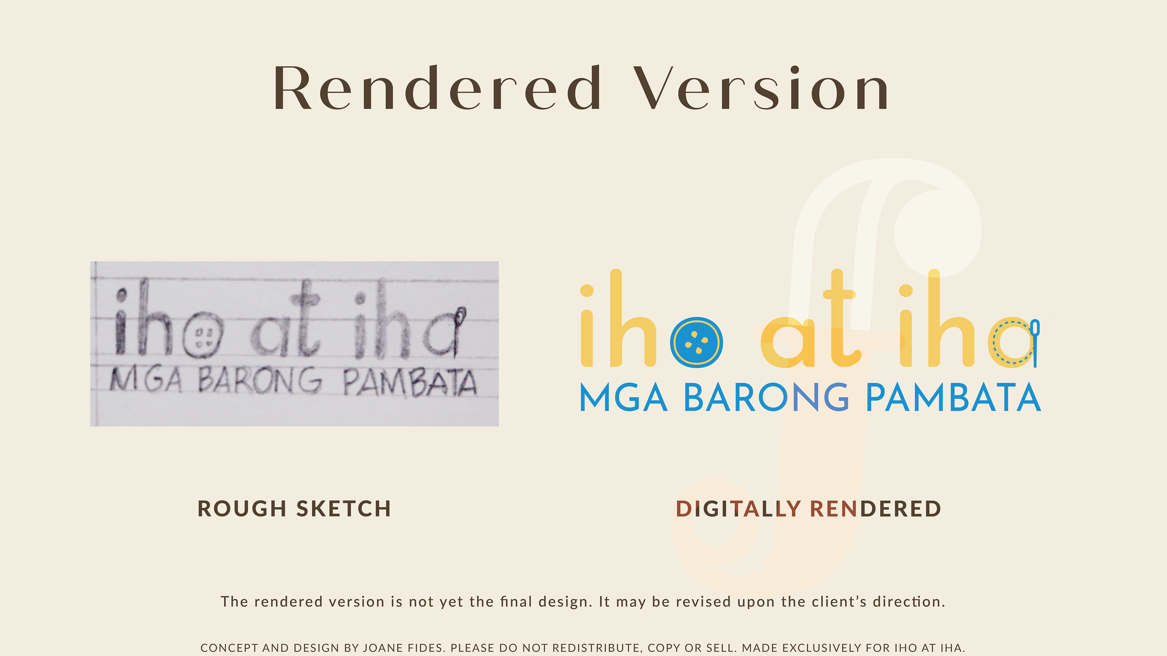
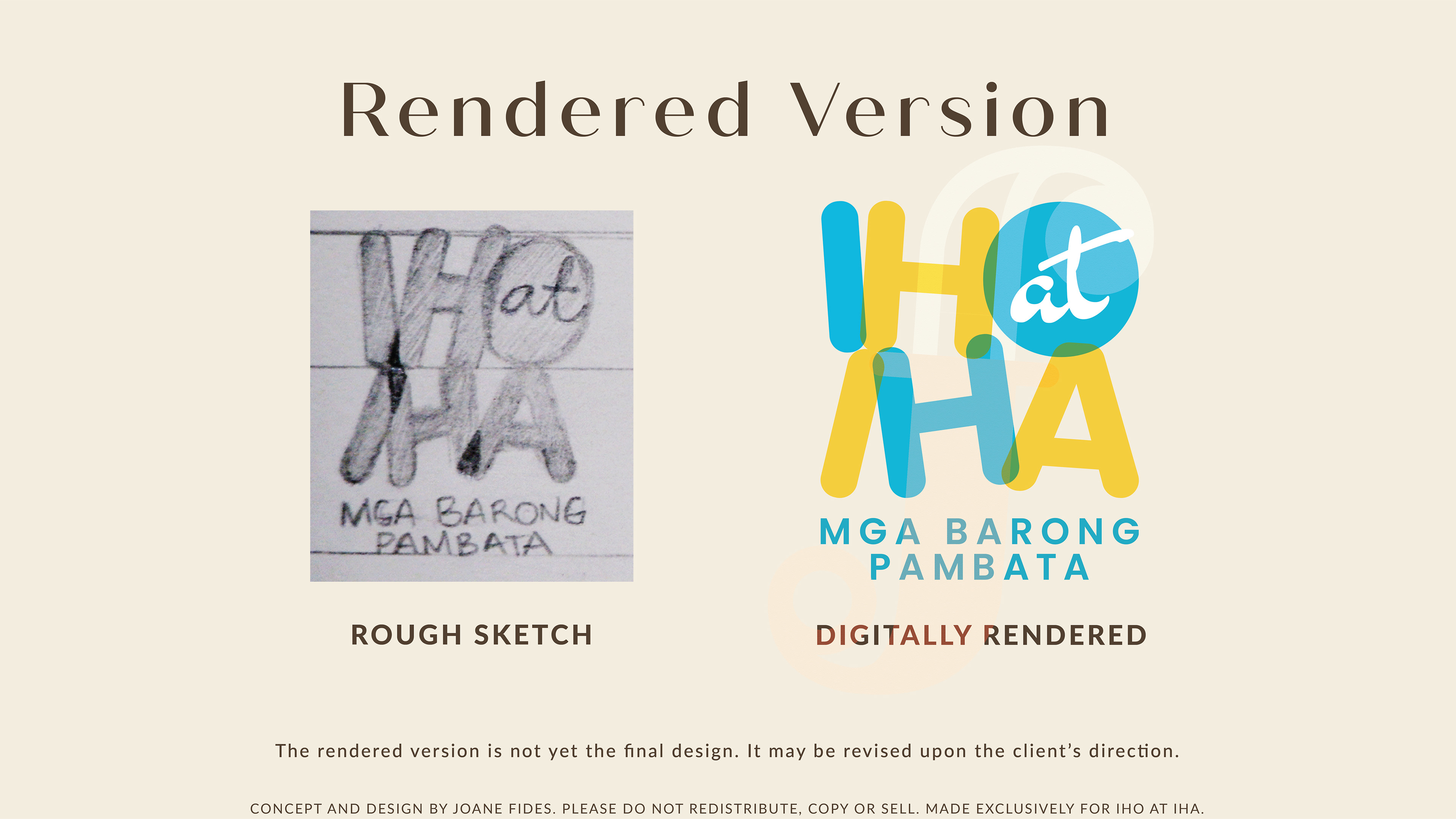
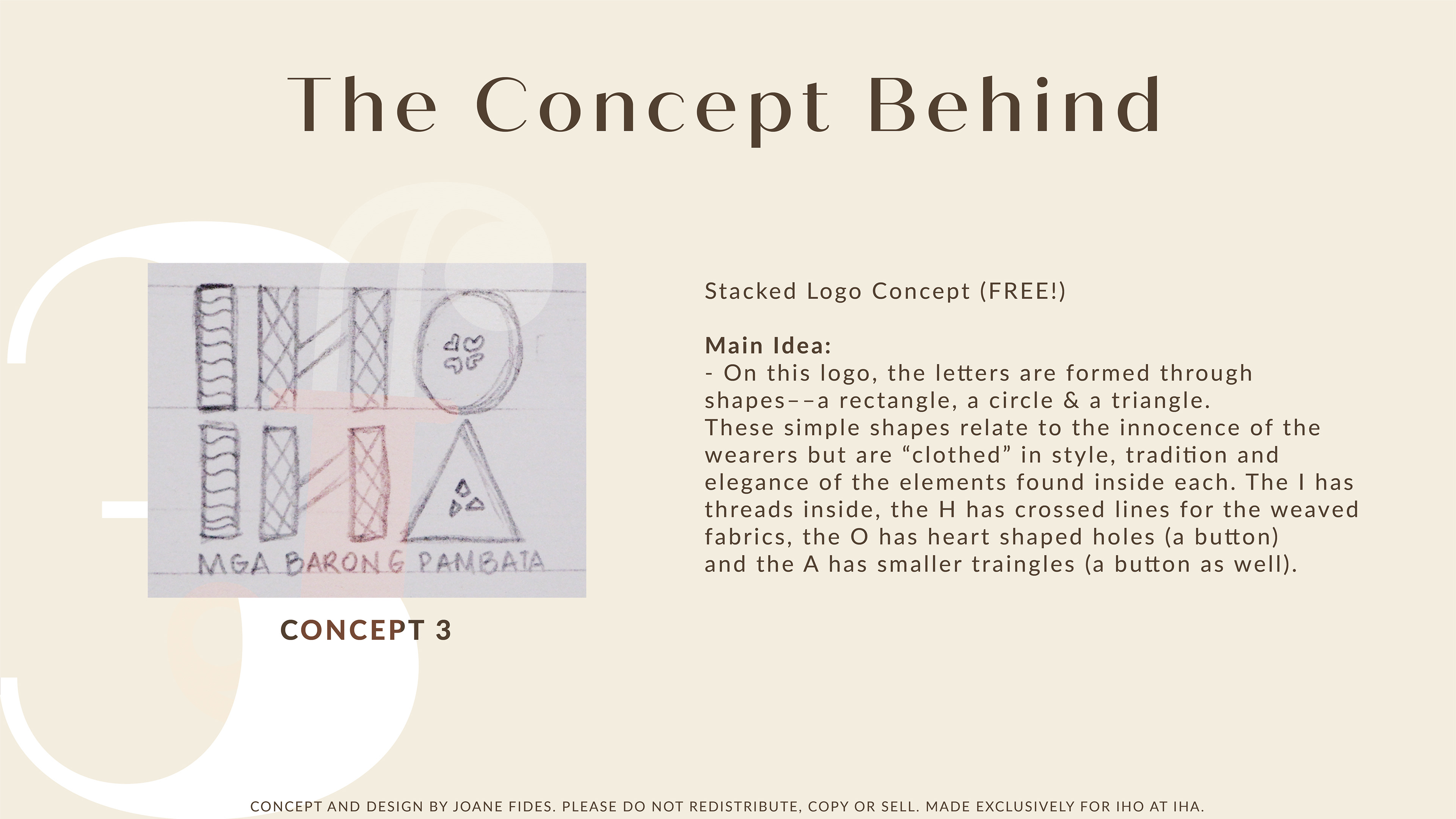
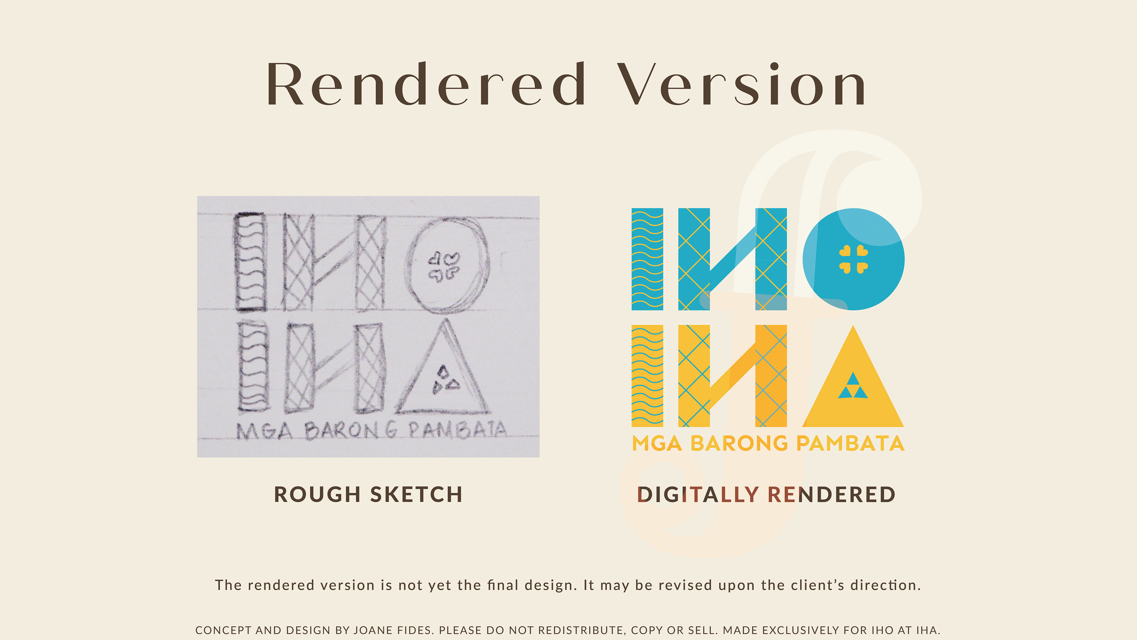
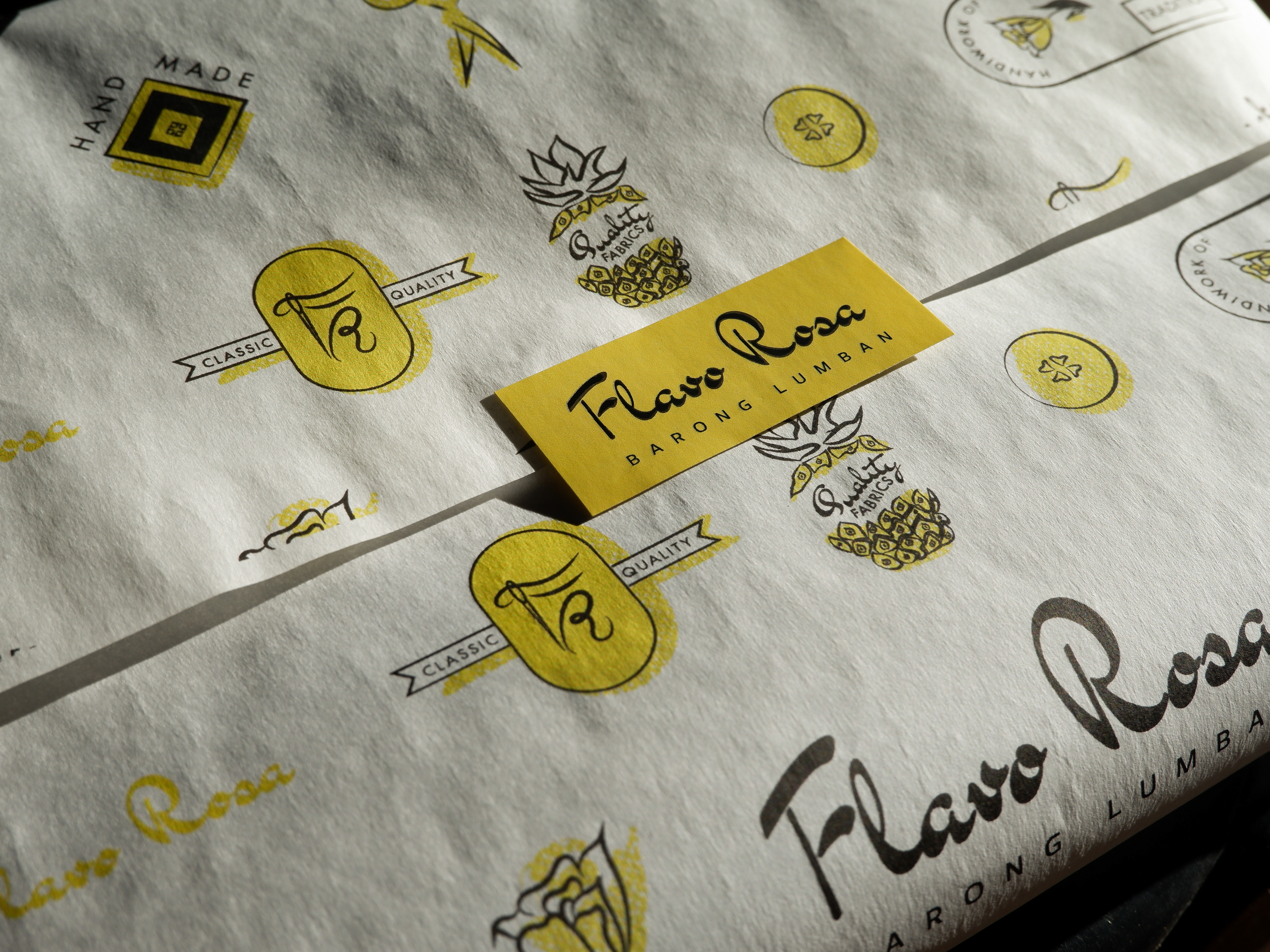
In order to create an impressive logo mark, I created a stylized logotype with illustrated letters o and a –– symbolizing a button and a thread passing through a needle respectively.
This simple yet straight-to-the-point design directly represents the brand's values and mission of providing quality yet functional traditional Filipino formal clothing for children of all ages.
