Organiland
Role Art Director, Designer, and Copywriter
The Challenge To create A+ modules and an Image stack for the brand's Amazon store using the rebranded identity and imagery
Year 2022
Year 2022
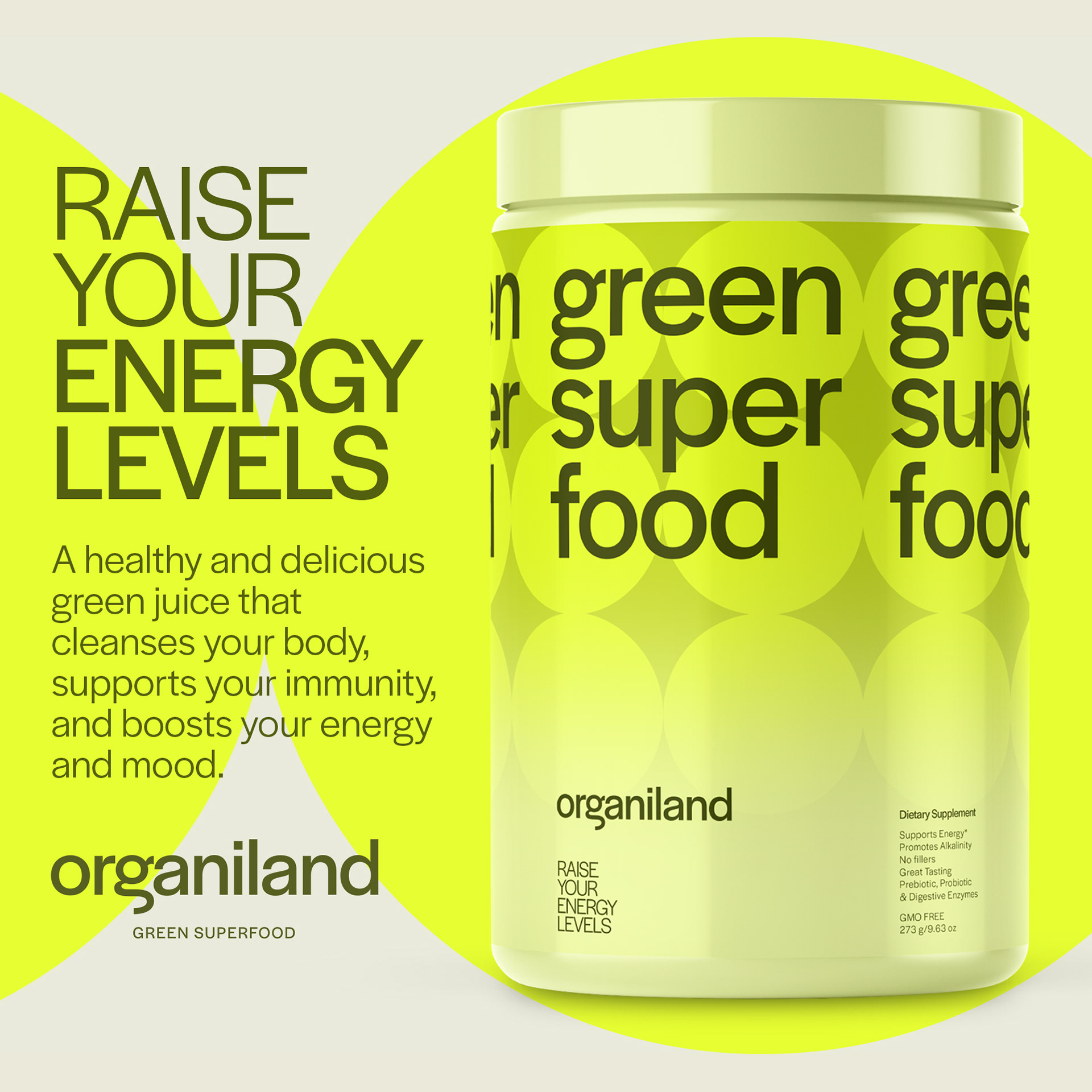
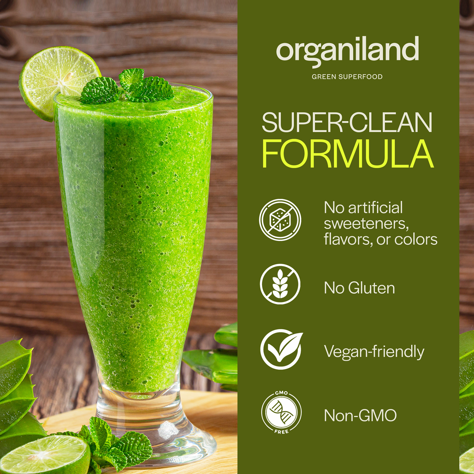
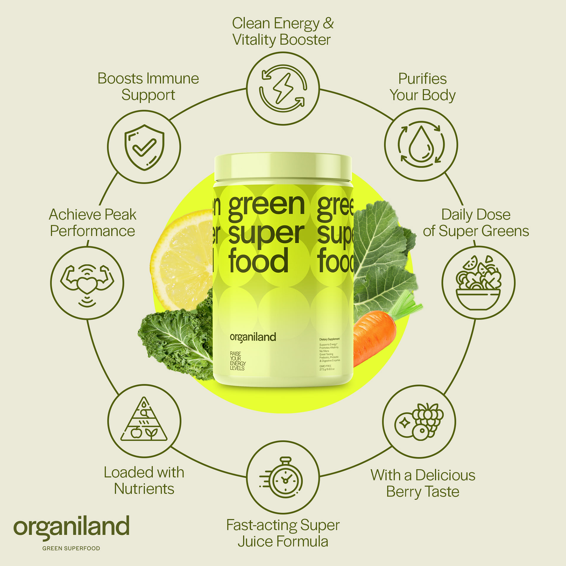
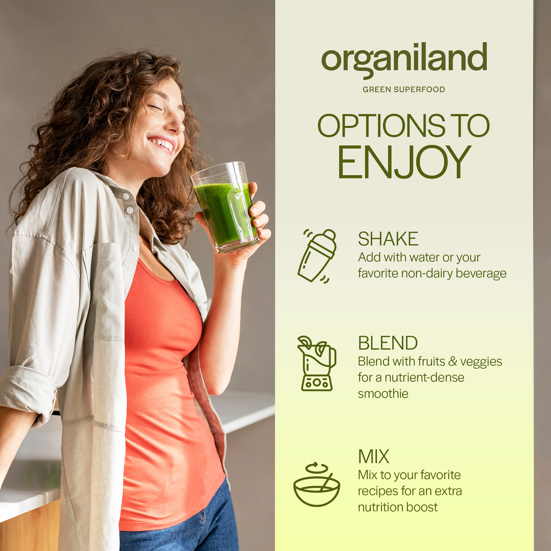
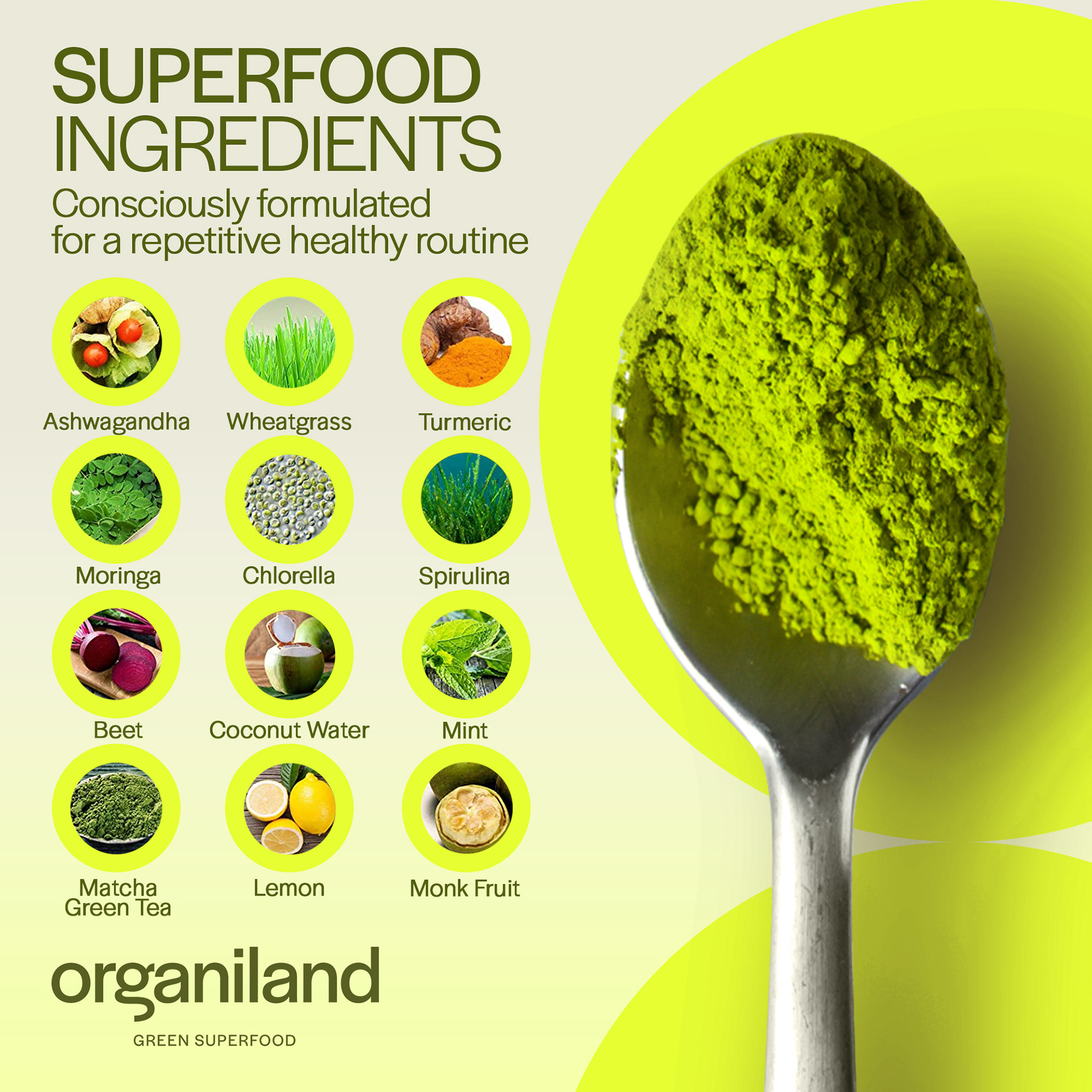
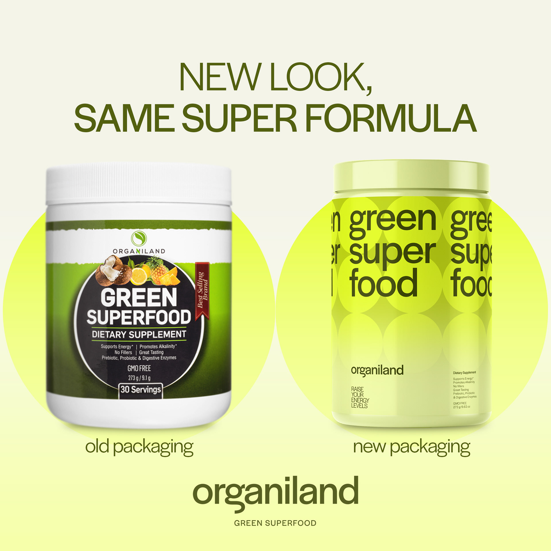
The Solution In this project, rebranding was done to elevate the brand's identity and positioning from its competitors. I was in charge of enhancing the brand's current Amazon store, including its A+ modules and Image stack.
Big idea Supercharge Your Health
While this was not seen as it is on any images (as the company has a particular slogan), this was applied in the direction and strategy for the ad collaterals. Highlighting the product's features, I used words such as SUPER, POWER, and ENERGY all throughout to support the development features it claims.

Shoutgriin
Role Art Director, Designer, and Copywriter
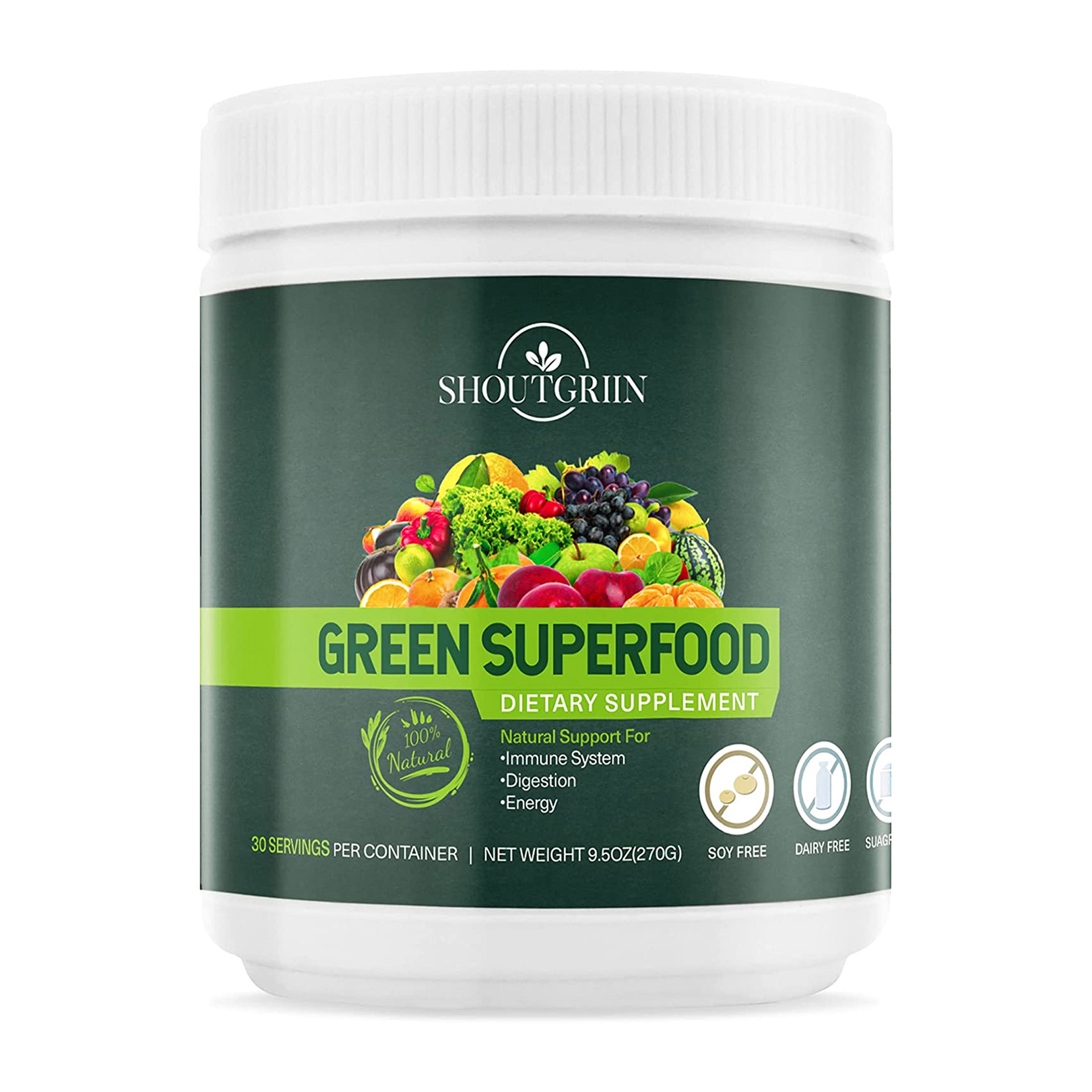
The Challenge To create A+ modules and Image Stacks for the brand without brand guidelines or restrictions, without overlapping with the previous brand above, Organiland, which is a competitor of this brand
Year 2022
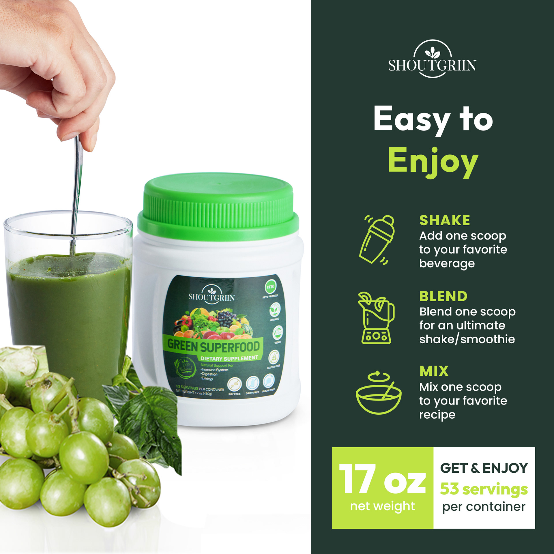
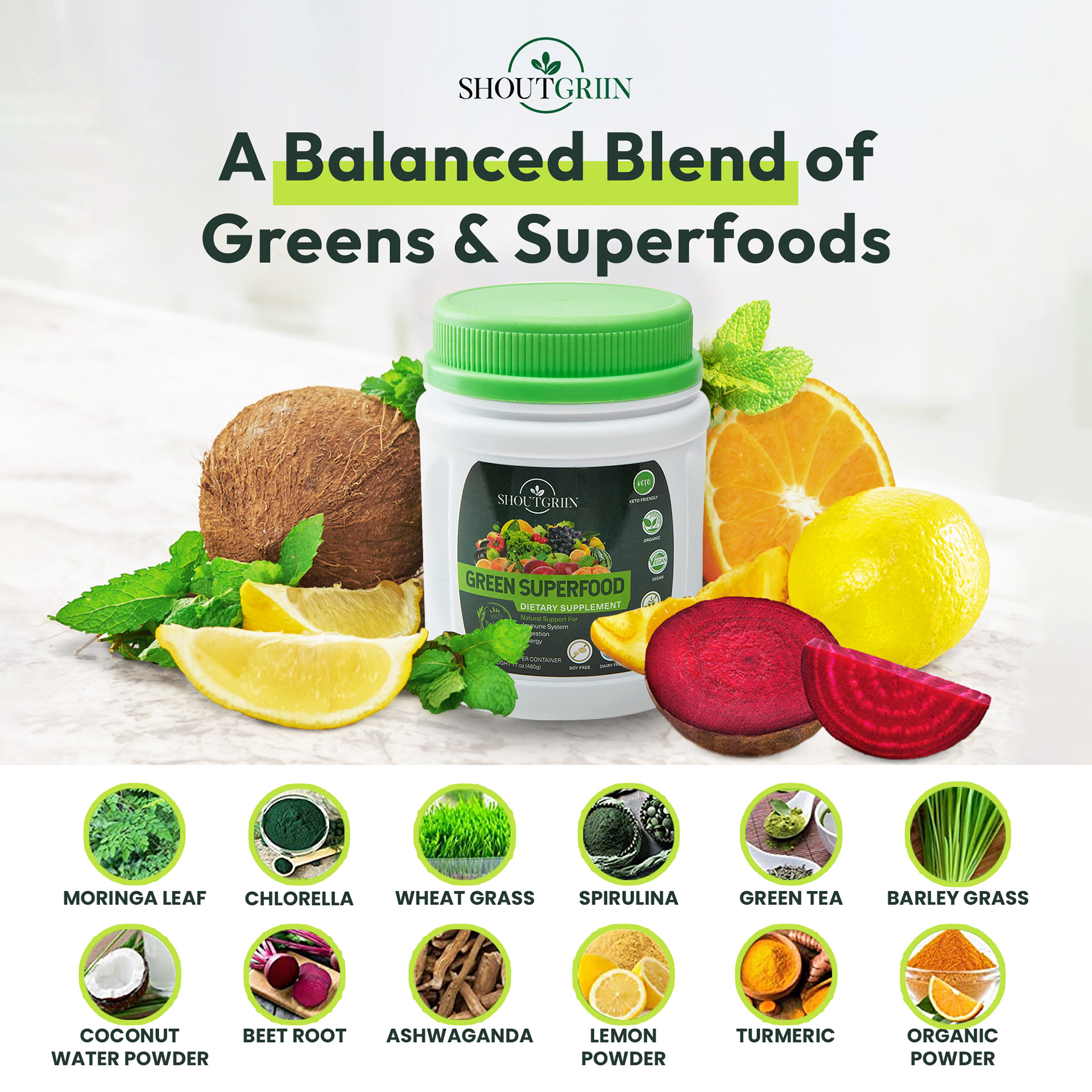
The Solution Coincidentally, our agency handled two brands of the same products that were actually each other's competitors. While it was a very tricky and challenging situation, both brands and their products have significant differences that could set them apart. And so, my direction and strategy started from that situation.
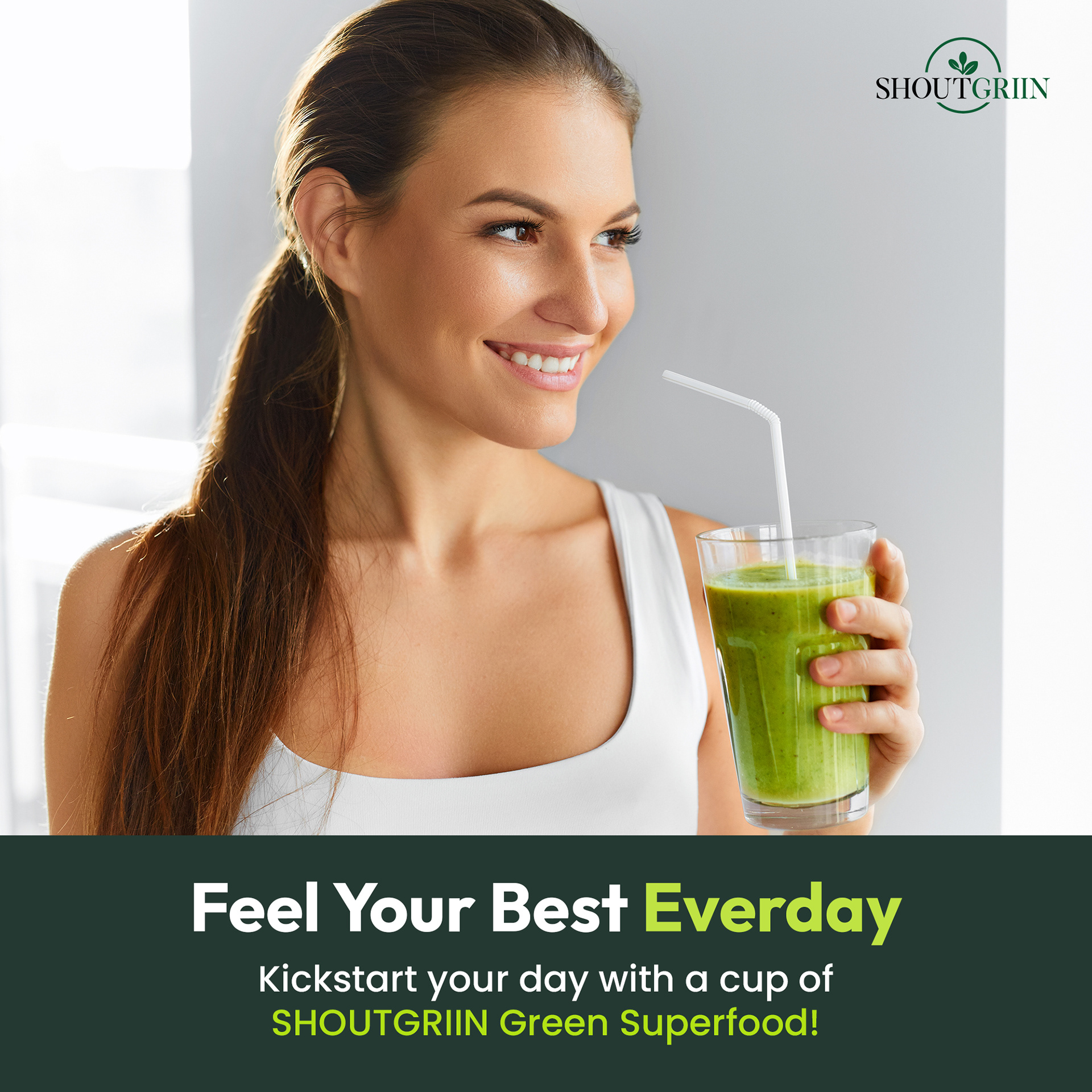
The Big Idea Feel Your Best Everyday
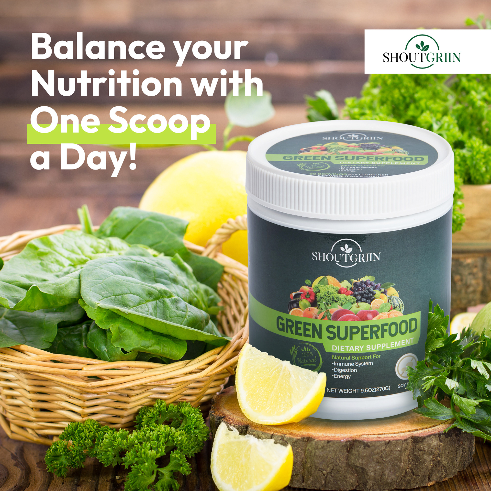
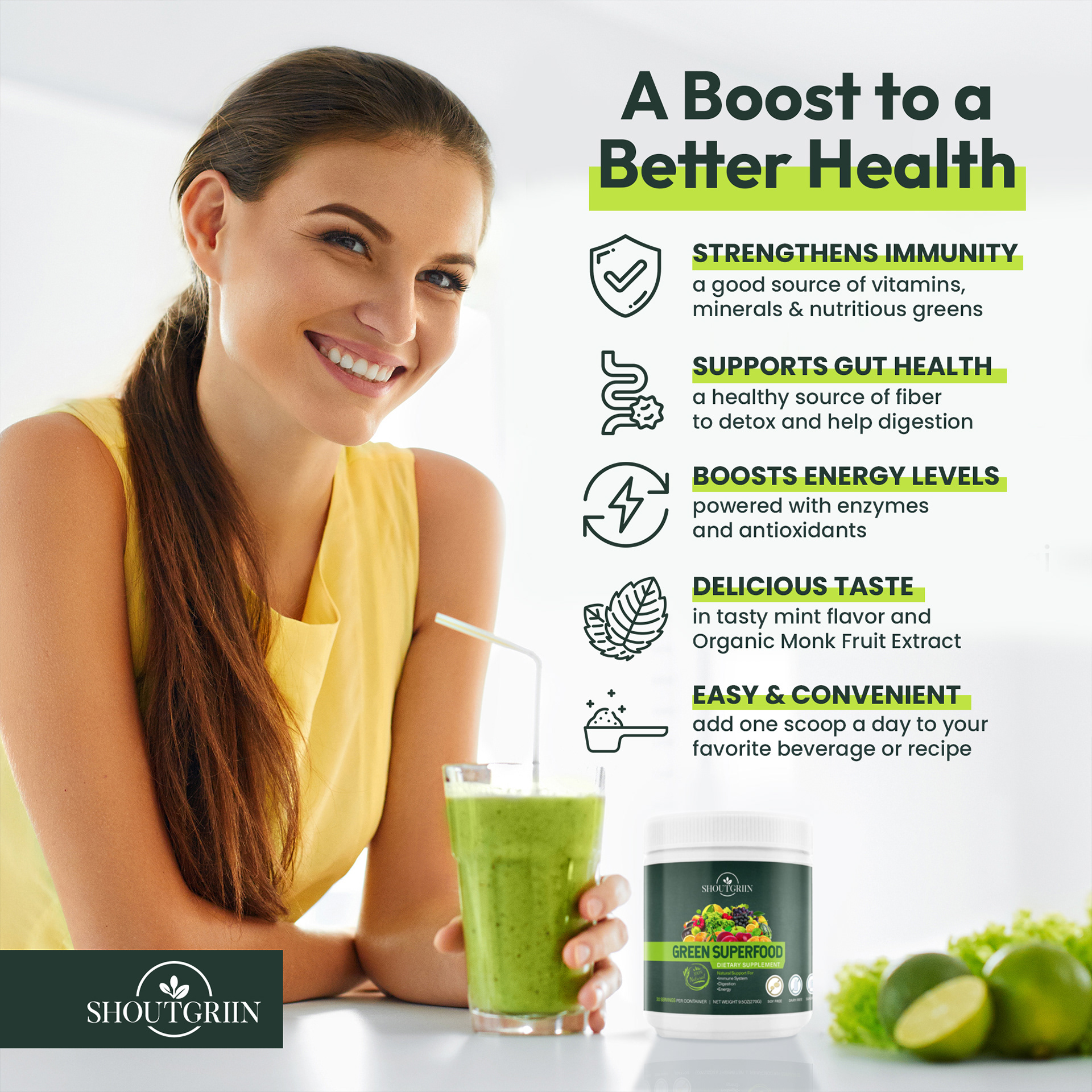
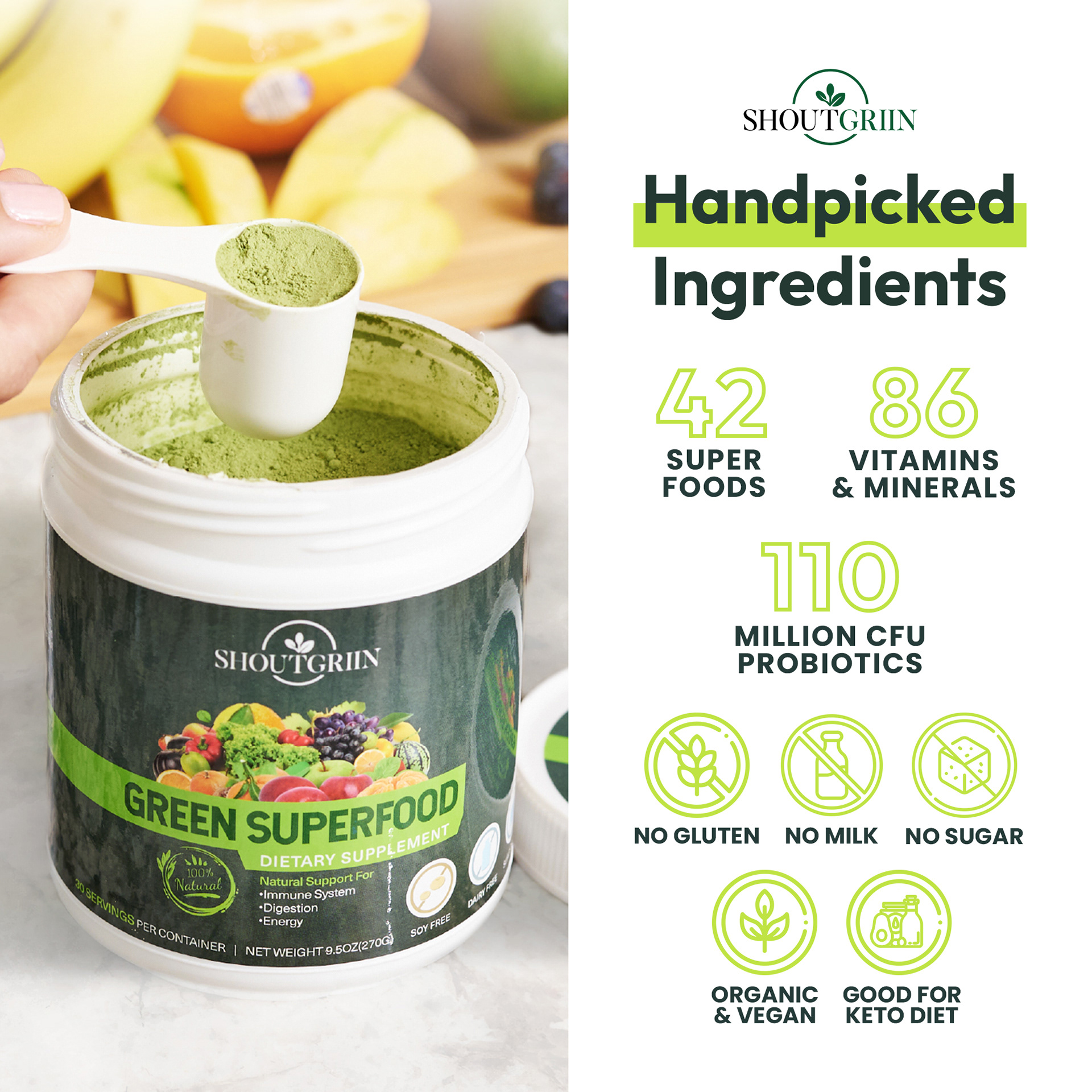
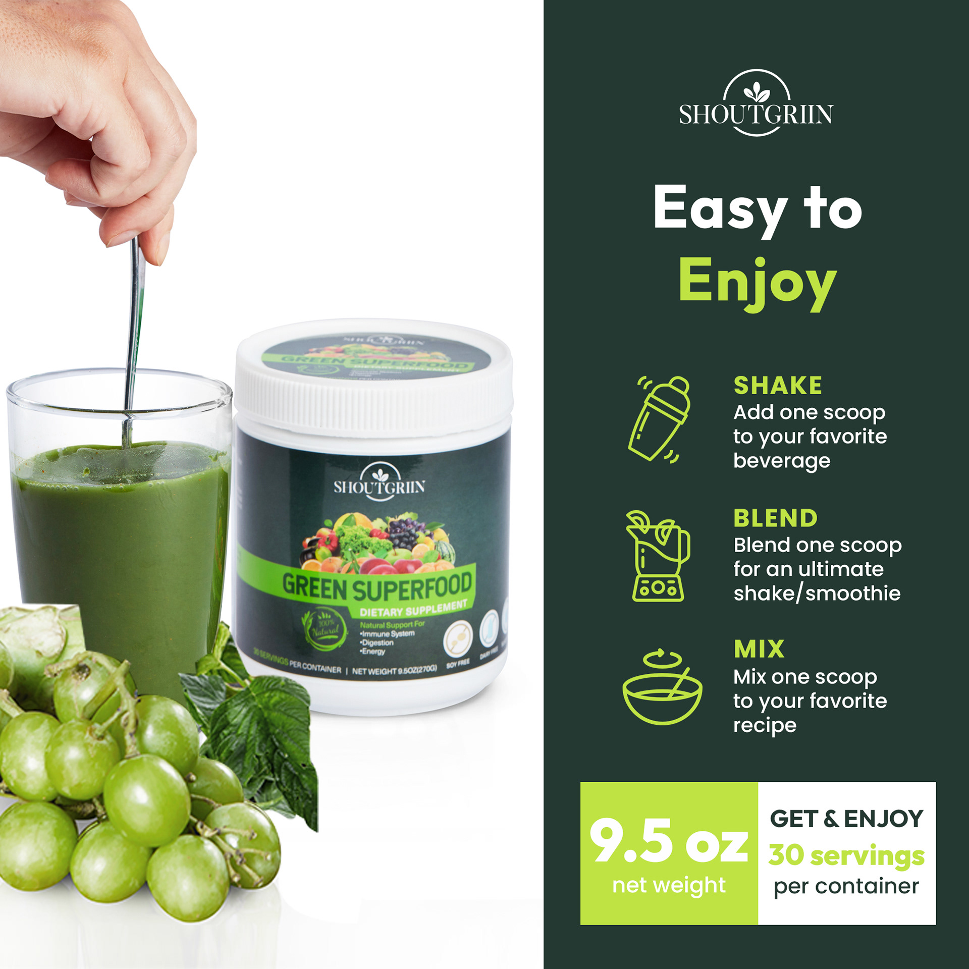
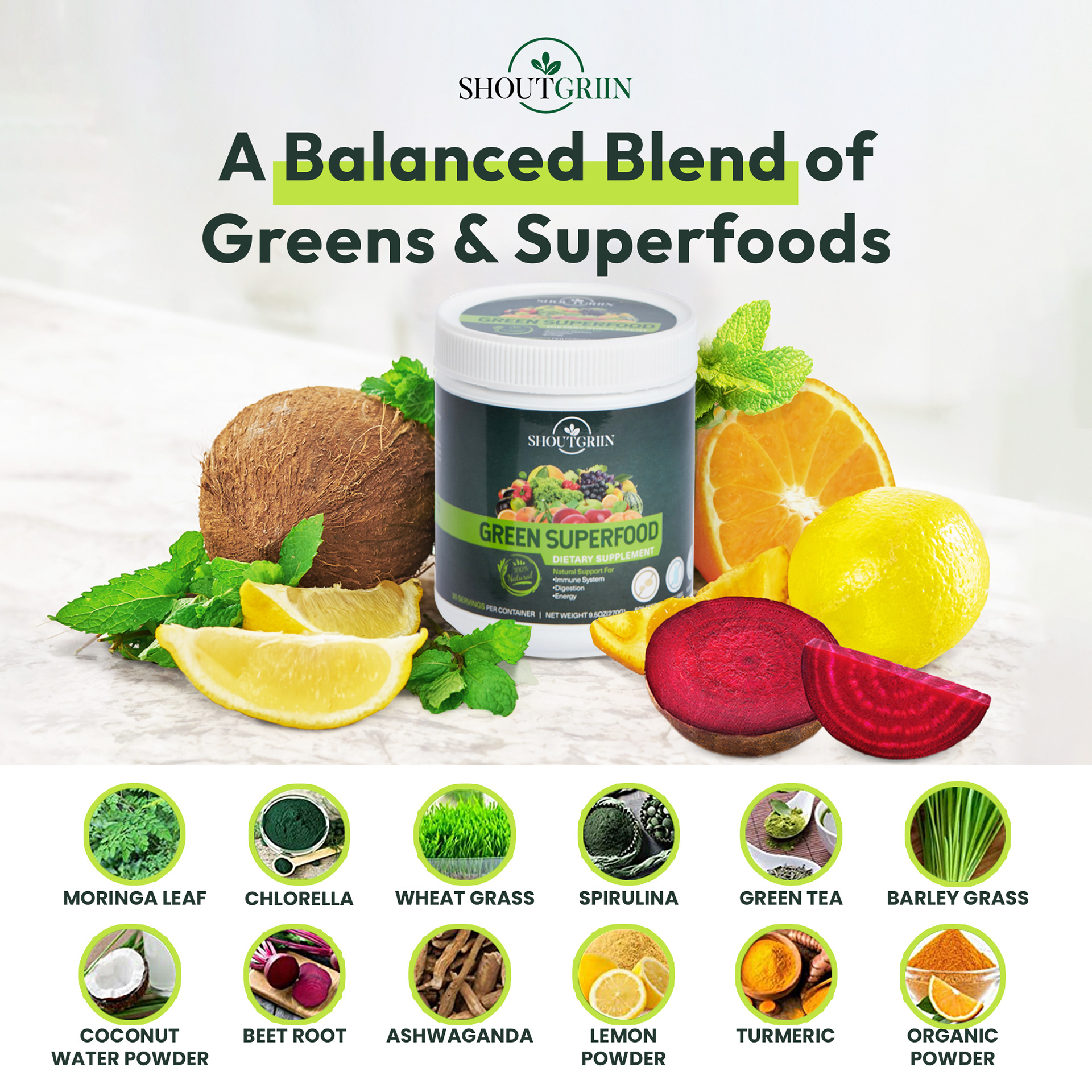
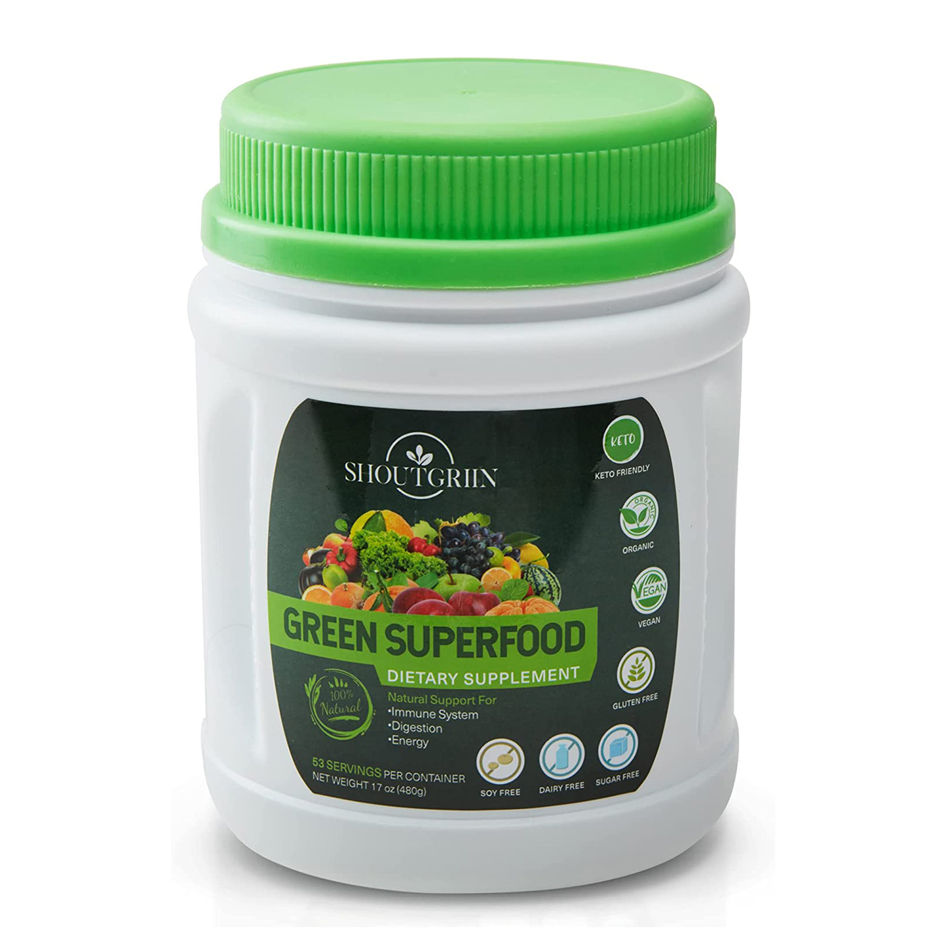
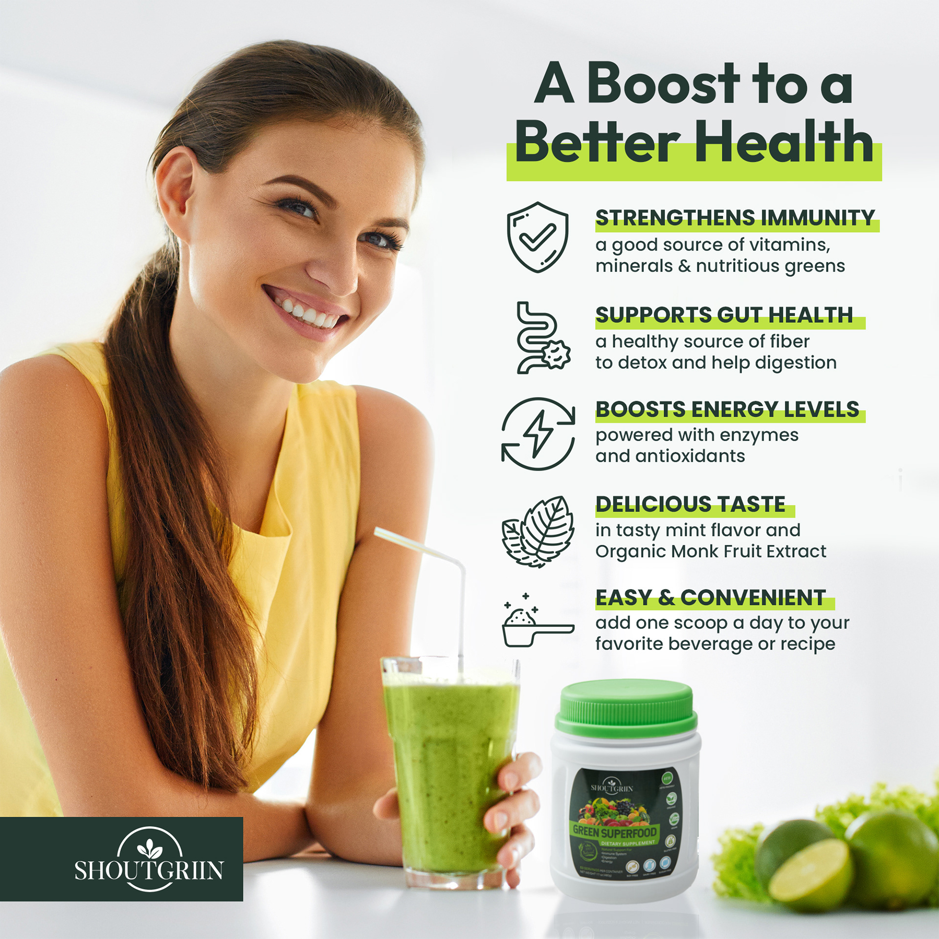
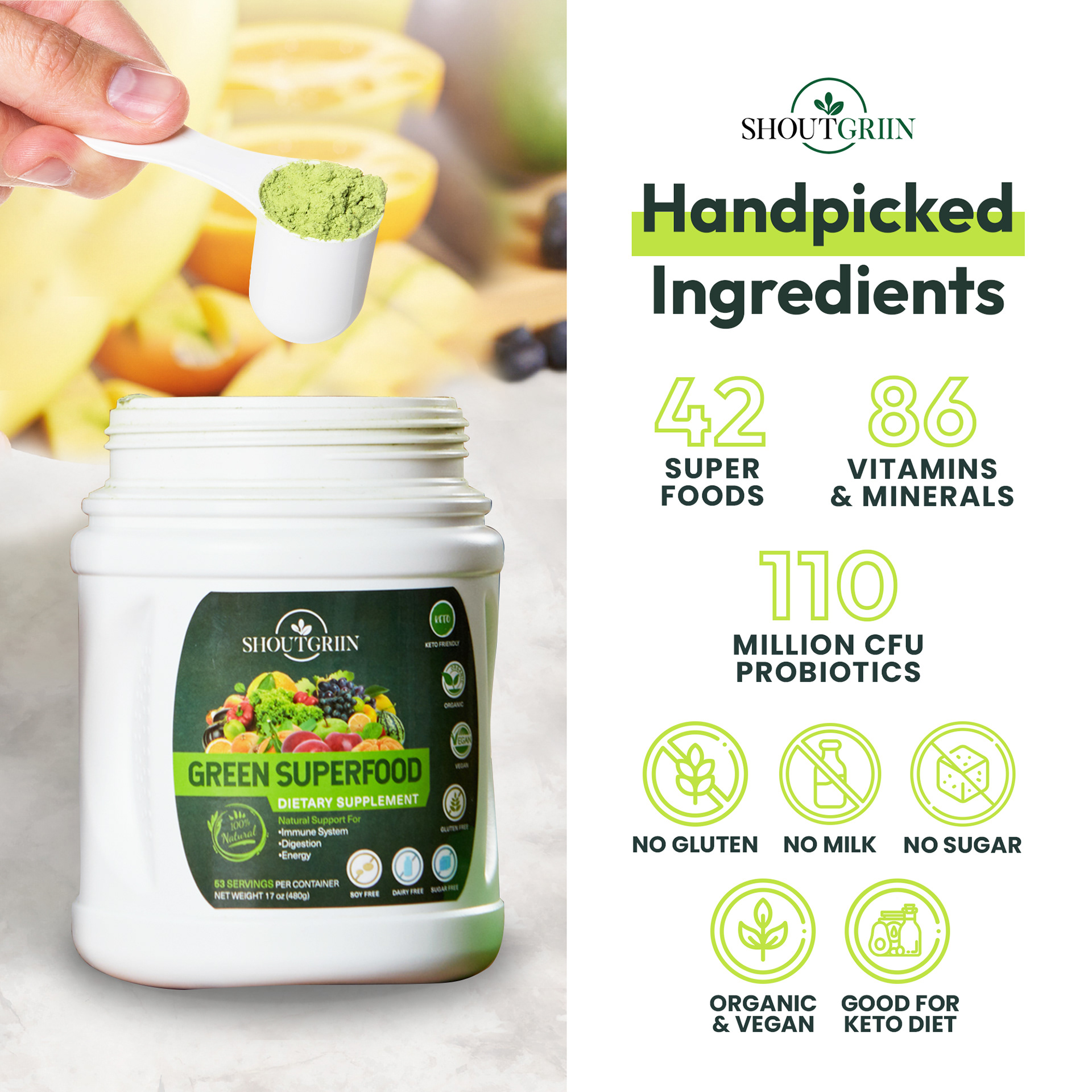
The strategy was to highlight the brand's benefits rather than its features to relate to its target market in a sense that would allow them to feel their very best every day they take the product. To support that, the line "one scoop" was repeated all throughout the images to emphasize the convenient nutrients one can get daily. With every scoop you take daily, you will transform your body and mind into your best version.




Serenk
Role Art Director and Designer
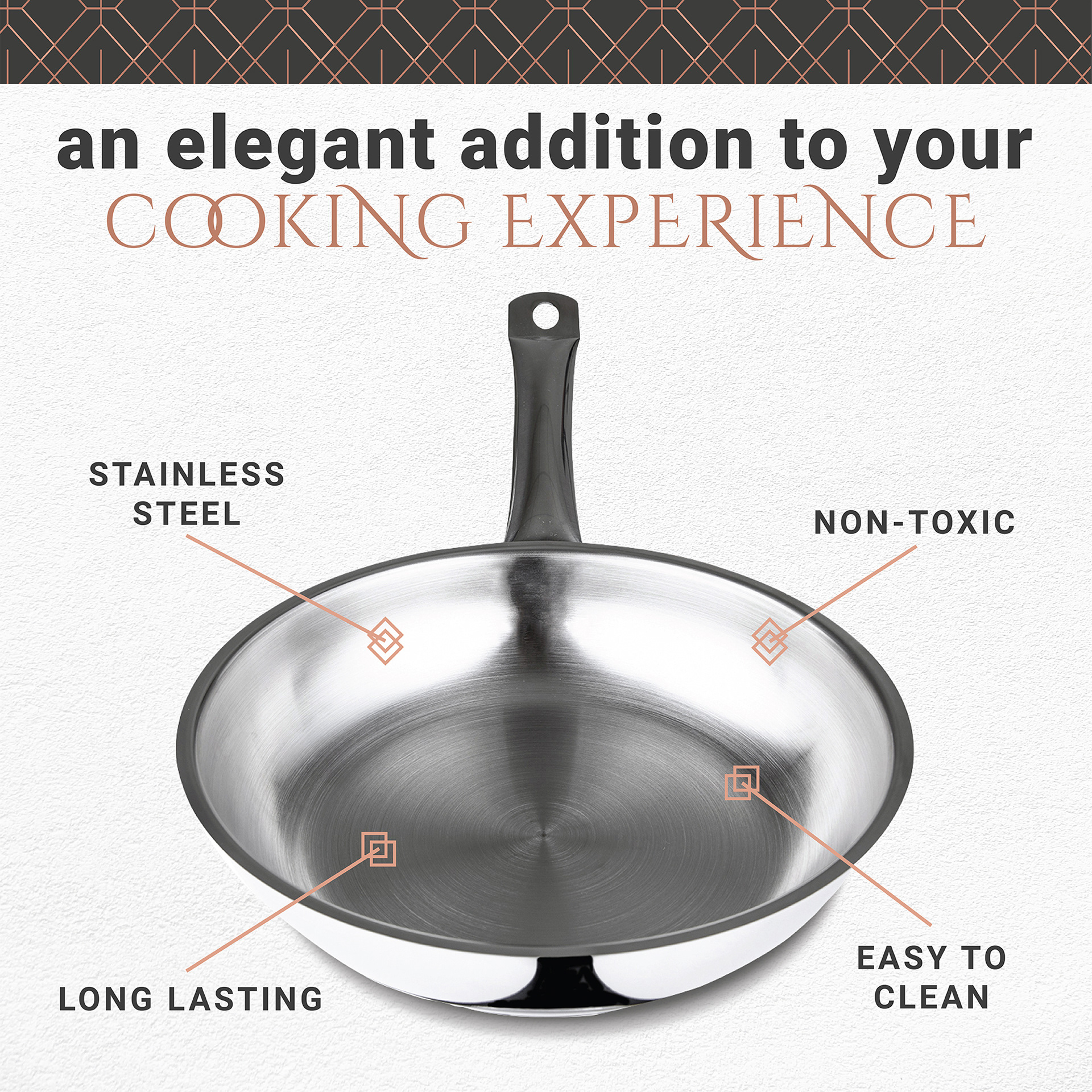
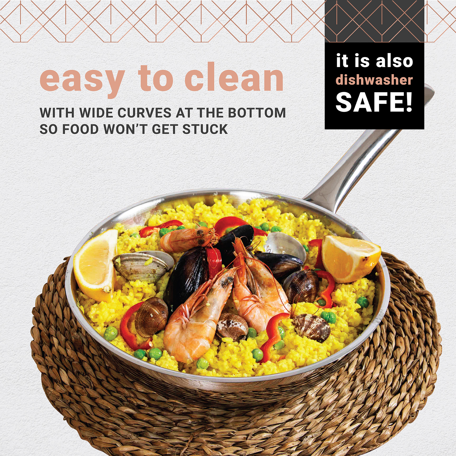
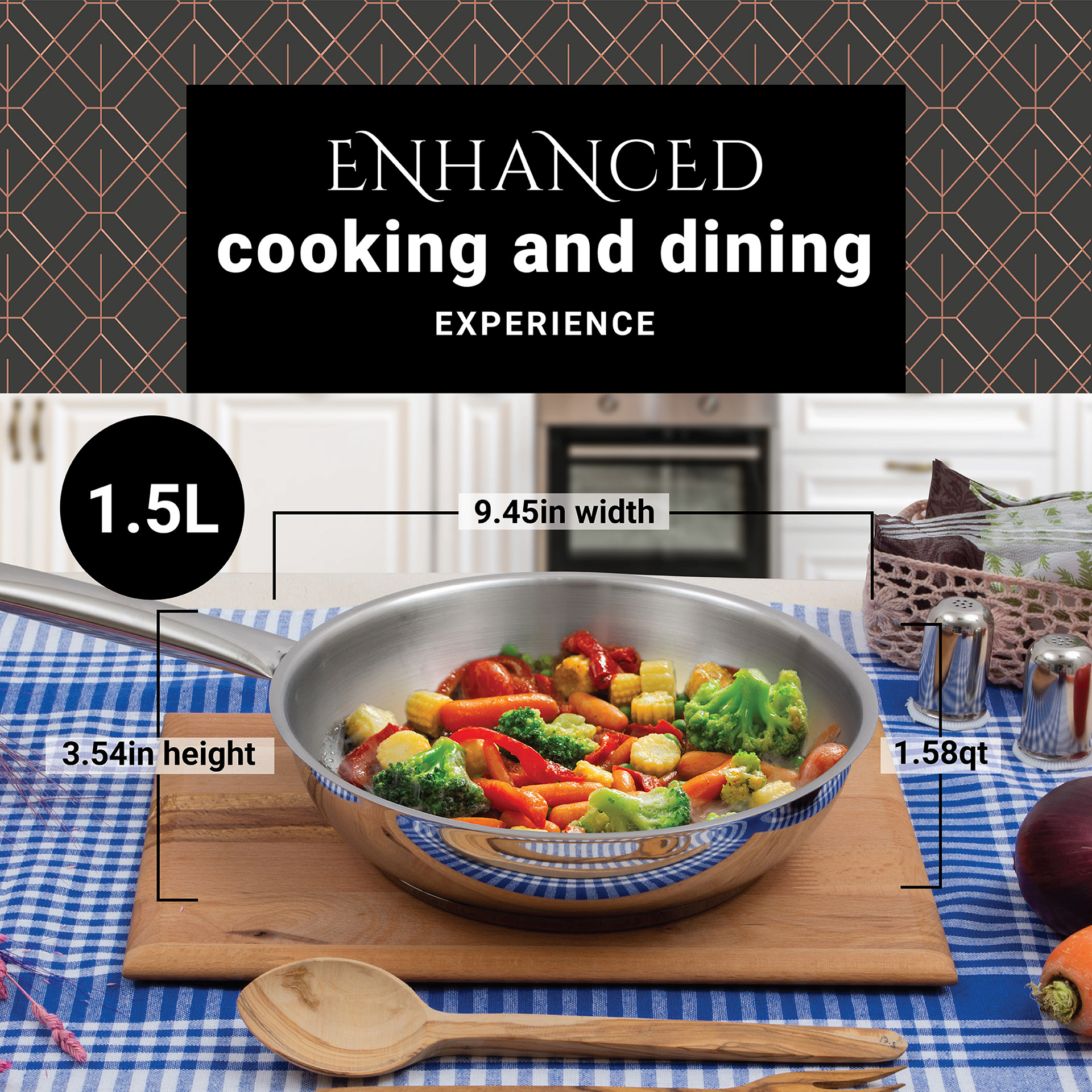
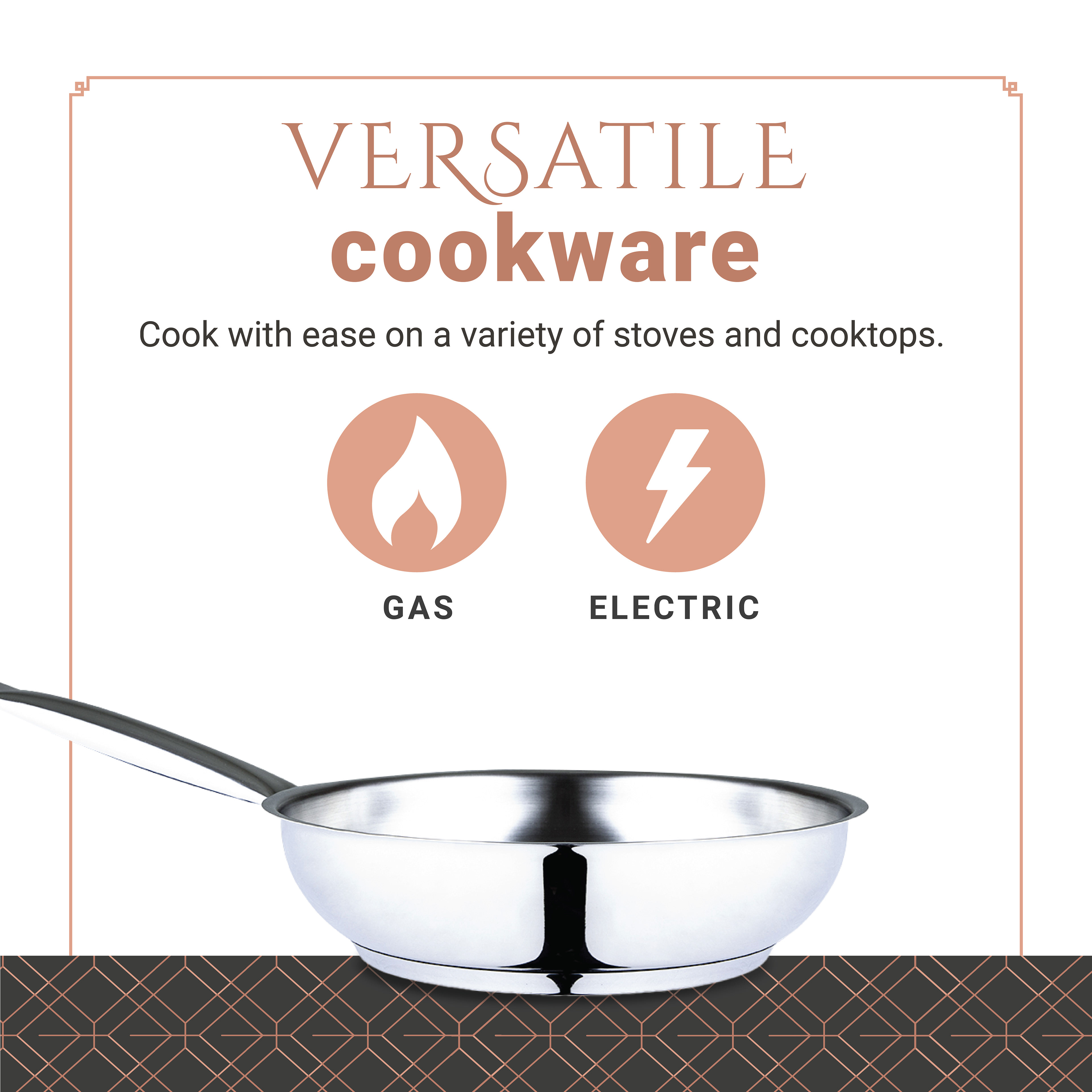
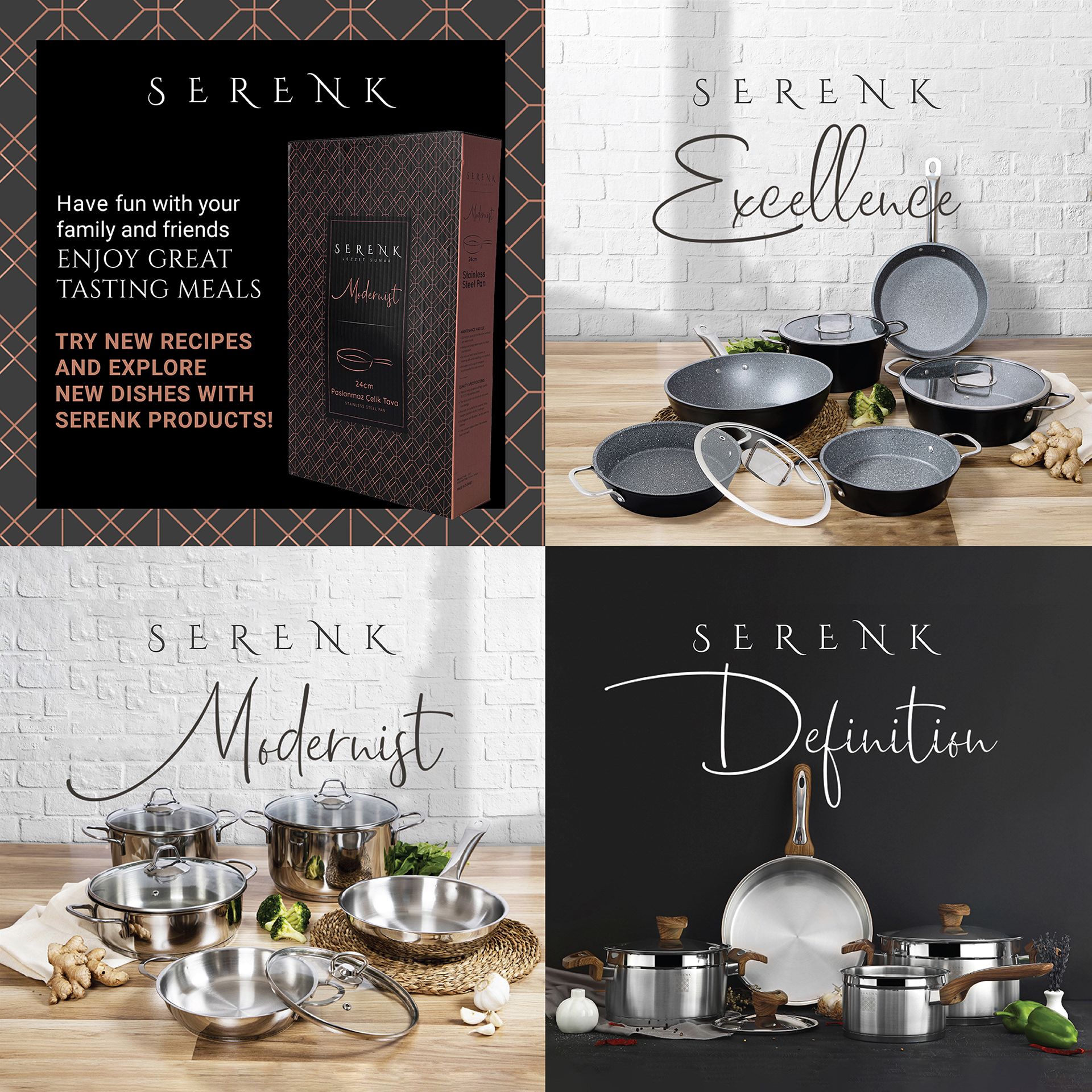
The Challenge To create A+ modules and an Image stack for the brand's Amazon store following their brand guidelines and restrictions
Year 2022
Year 2022
The Solution This brand wanted its design to adhere to the traditional Turkish designs so it was indeed tricky to play with the design. Relatively, the products themselves were a bit common on the market so being able to elevate them through design was a part of the strategy.
The brand's identity was a bit on the darker side so in order to combat the gloomy atmosphere it could create, I made use of colors that can serve as a contrast (beige and white) and images of bright-colored foods that could emphasize the products as well.
